Digital Sky
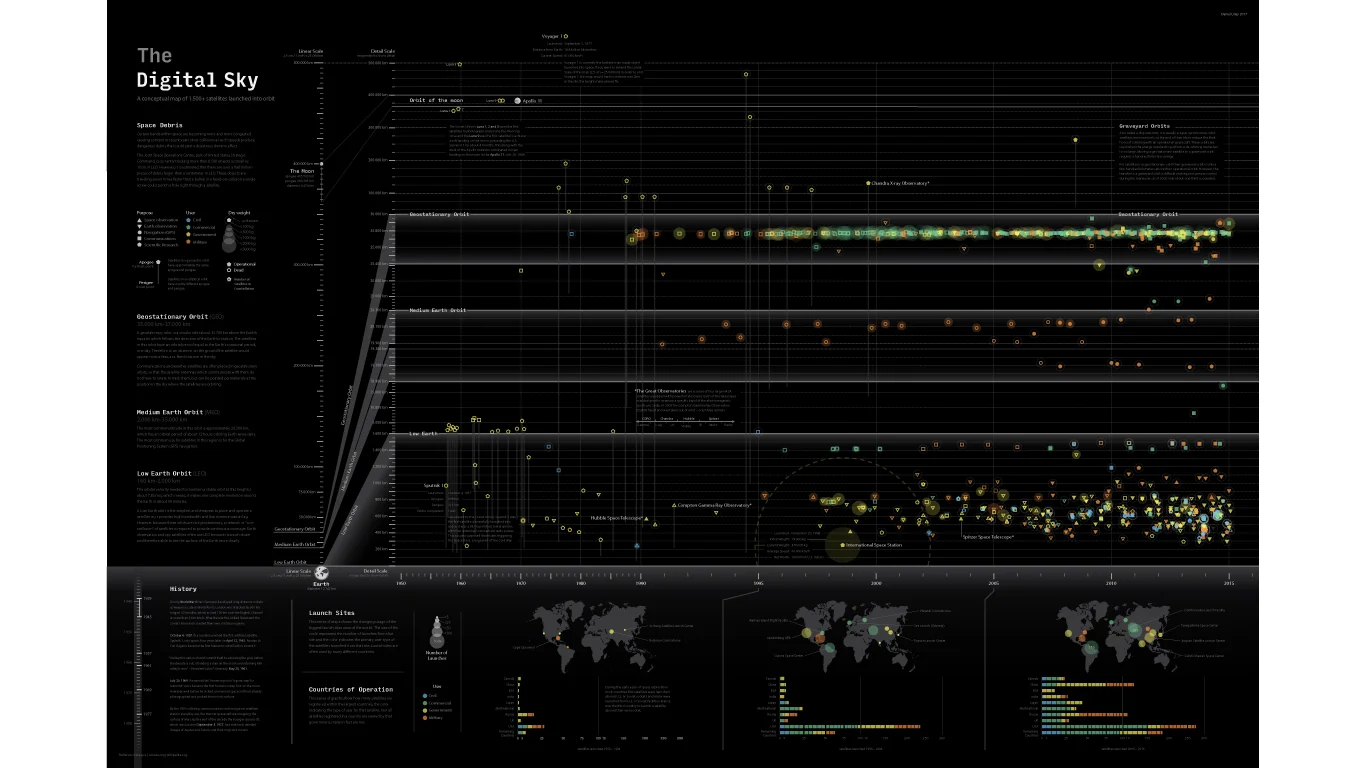
For Years the Union of Concerned Scientist has been assembling a massive database of over 1,400 satellites launched into orbit. This infographic, maps every one of those satellites as well as hundreds more historical satellites along a timeline that illustrates the different trends and growing clutter of satellites in orbit. This conceptual map is overflowing with things to learn and teach. It is the perfect gift for adults and children alike who are interested in science and technology.
This infographic provides up to eight data points for every satellite launched. Each satellite is represented by a unique symbol: the shape indicates its purpose, the color represents the user, the size shows its weight, its vertical position shows apogee and if it has an elliptical orbit the line descending from it shows the perigee. Icons with a number in them indicate a constellation of that number satellites . If the icon is hollow the satellite is “dead” no longer in use, however that does not mean it has necessarily fallen out of orbit, some satellites are sent into “Graveyard orbits”. A provided equation allows you to roughly calculate if a satellite has dropped out of orbit and burned up.
The bands within space where the vast majority of satellites orbit are incredibly narrow and far apart. In order to capture this detail but also show the immense scale accurately this maps incorporates a linear scale and a detailed scale.
The Detail scale magnifies the three bands in which most satellites orbit nearly a hundred times. This allows you to see just how cluttered they are. These bands are: Low Earth Orbit (LEO), Medium Earth Orbit (MEO), and the narrow Geostationary orbit (GEO).
The linear scale shows just how vast the space is between these bands are and even more so how far away many of our satellites travel. On this scale the earth is smaller than a dime. and Voyager 1 (the furthest man made object launched into space) would be over a mile away.
Launch Sites
This infographic also has a series of maps that show the changing usage of the biggest launch sites around the world. The size of the circle represents the number of launches from that site and the color indicates the primary user type of the satellites launched from that site. Launch sites are often used by many different countries
Countries of Operation
This series of graphs also show how many satellites are registered within the largest countries, the color indicating the type of user for that satellite. Not all satellites registered in a country are owned by that government, many are corporate or owned by smaller countries.


