Tilt
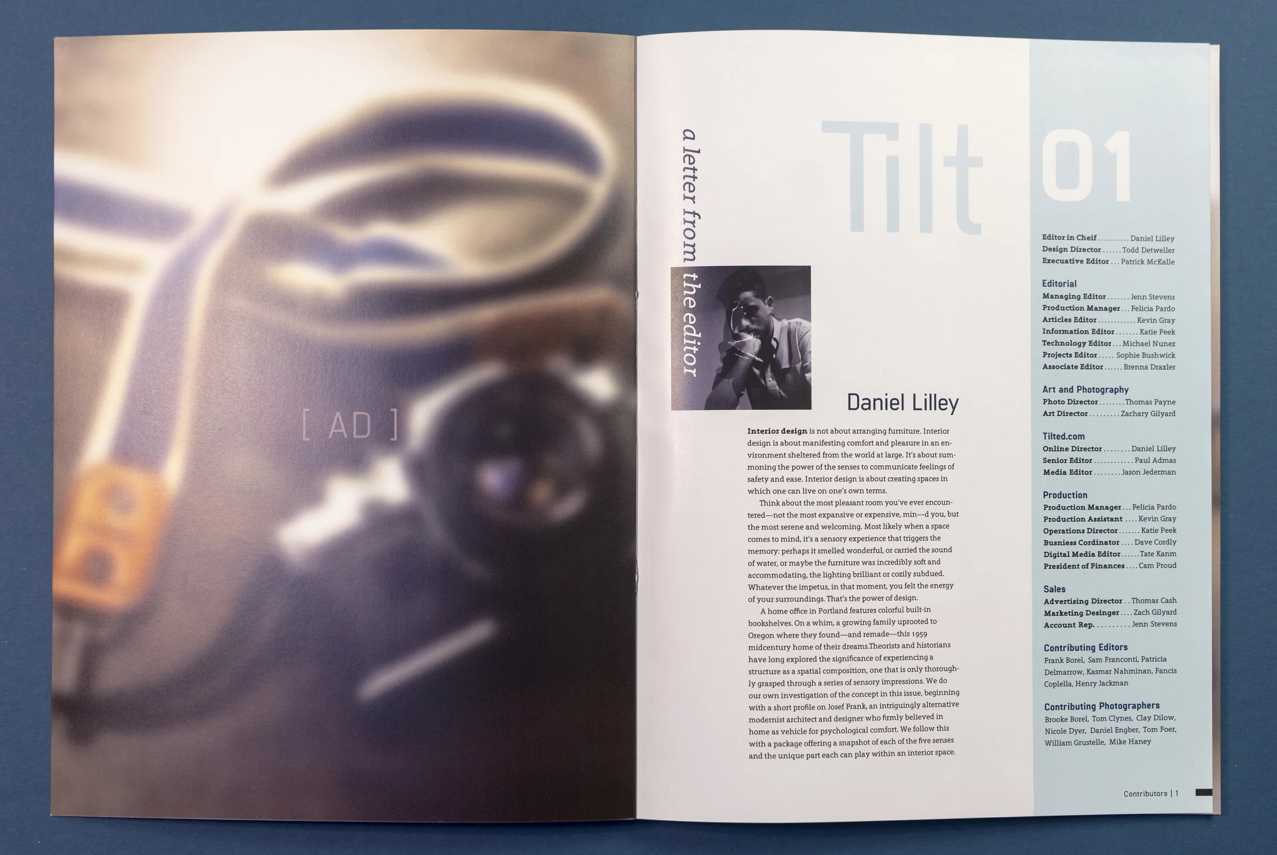
I’ve always been interested in architecture and interior design; I initially went to college for architecture. So when I was assigned to make a magazine I decided to make a high end modern architecture and design magazine.
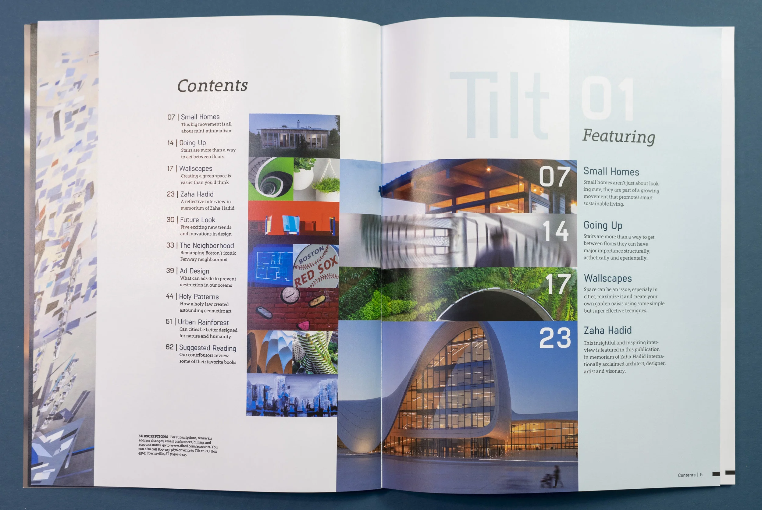
The name “Tilt” and its logo embody the common ideals of modern design, clean lines, subtle curves and angles. The logo reminiscent of skyscrapers, a windowed facade, even a floor plan,
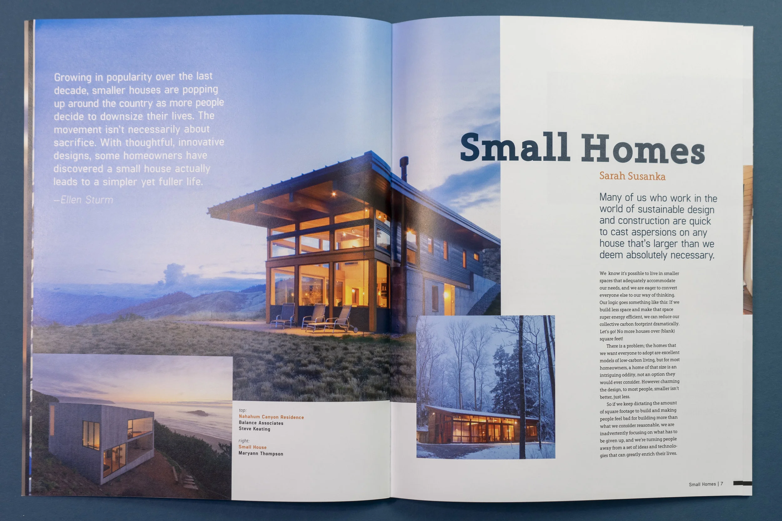
This article about small homes show how, if they are well designed, they can still feel spacious yet inviting. I accent this by keeping the body text fairly tight but with plenty of pockets of white space. Throughout the article the use of small pictures for the outside of the homes but larger interior shots highlights how spacious the space can be.
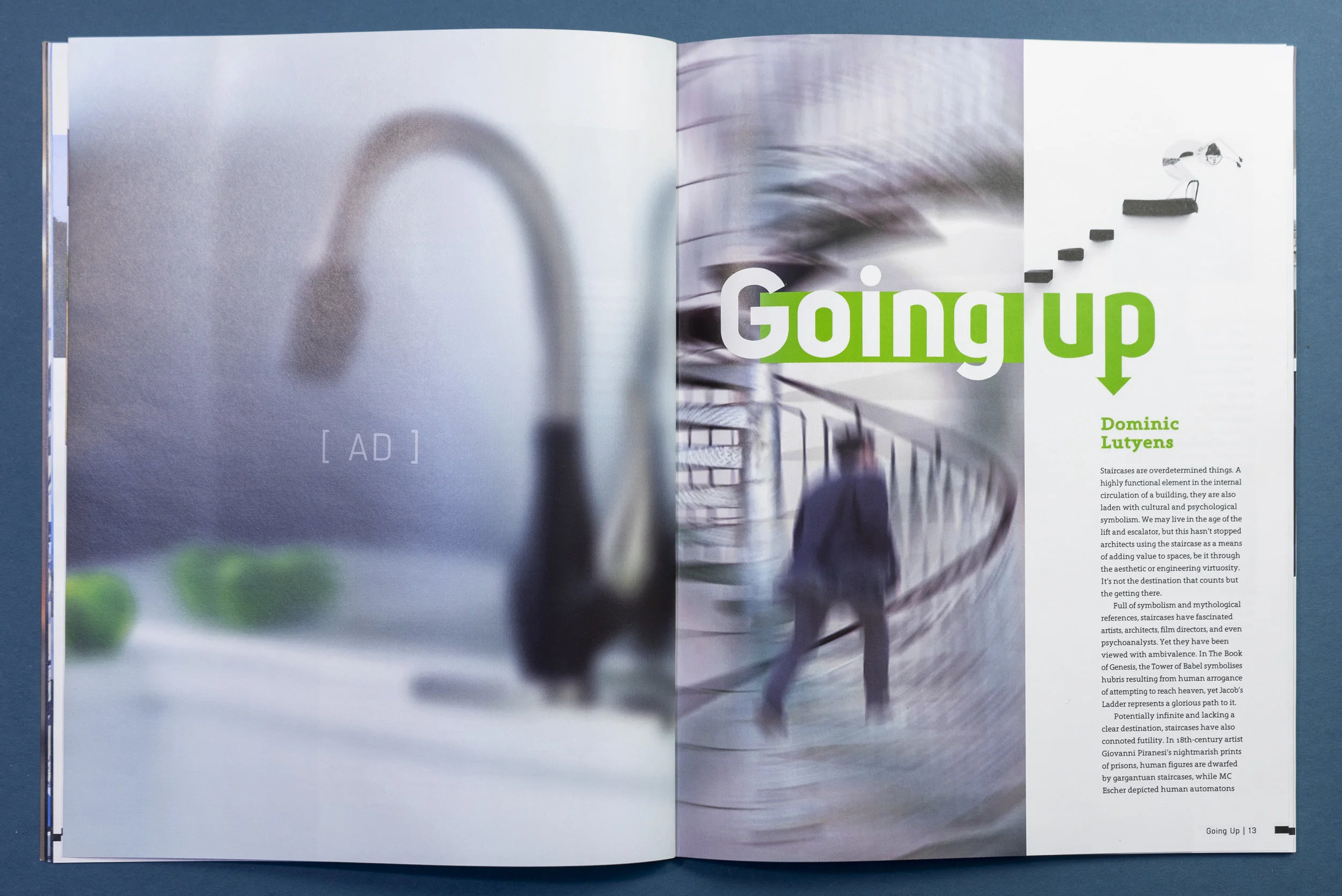
In this article I wanted be experimental, push the design as far as what would still fit in to the magazine. I played a lot with vertical space leaving the text blocks long and spread apart, incorporating stairs always going up and to the right so as to draw the readers eyes up and down as they scan the page.
Taking inspiration from home and garden magazines for this article, I pushed the magazines system, making the type and columns larger, included more pull quotes and bullet points; while still keeping the minimalist modern aesthetic of the magazine.
In memoriam of Zaha Hadid this interview, had shortly before her death, highlights her amazing outlook on architecture, design, and a modernizing society; the layout lets her work speak for itself. Subtle visual flow established with; scale, position and color of photographs as well as pull quotes, complements the amazing movement she had within her work.
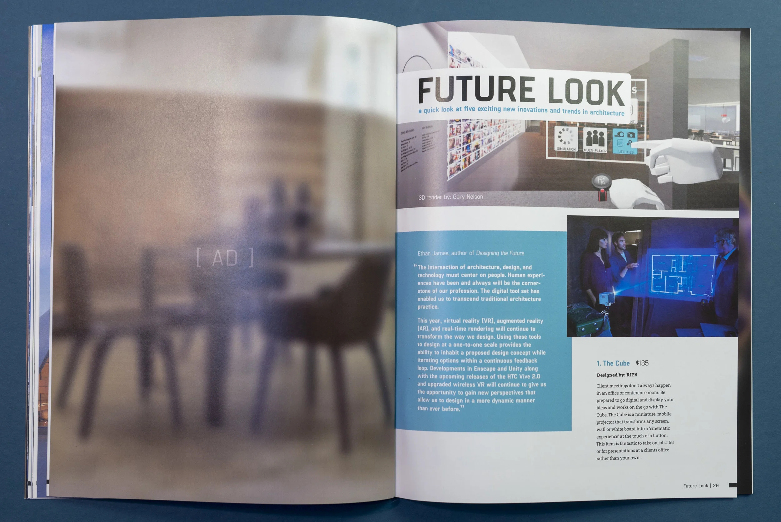
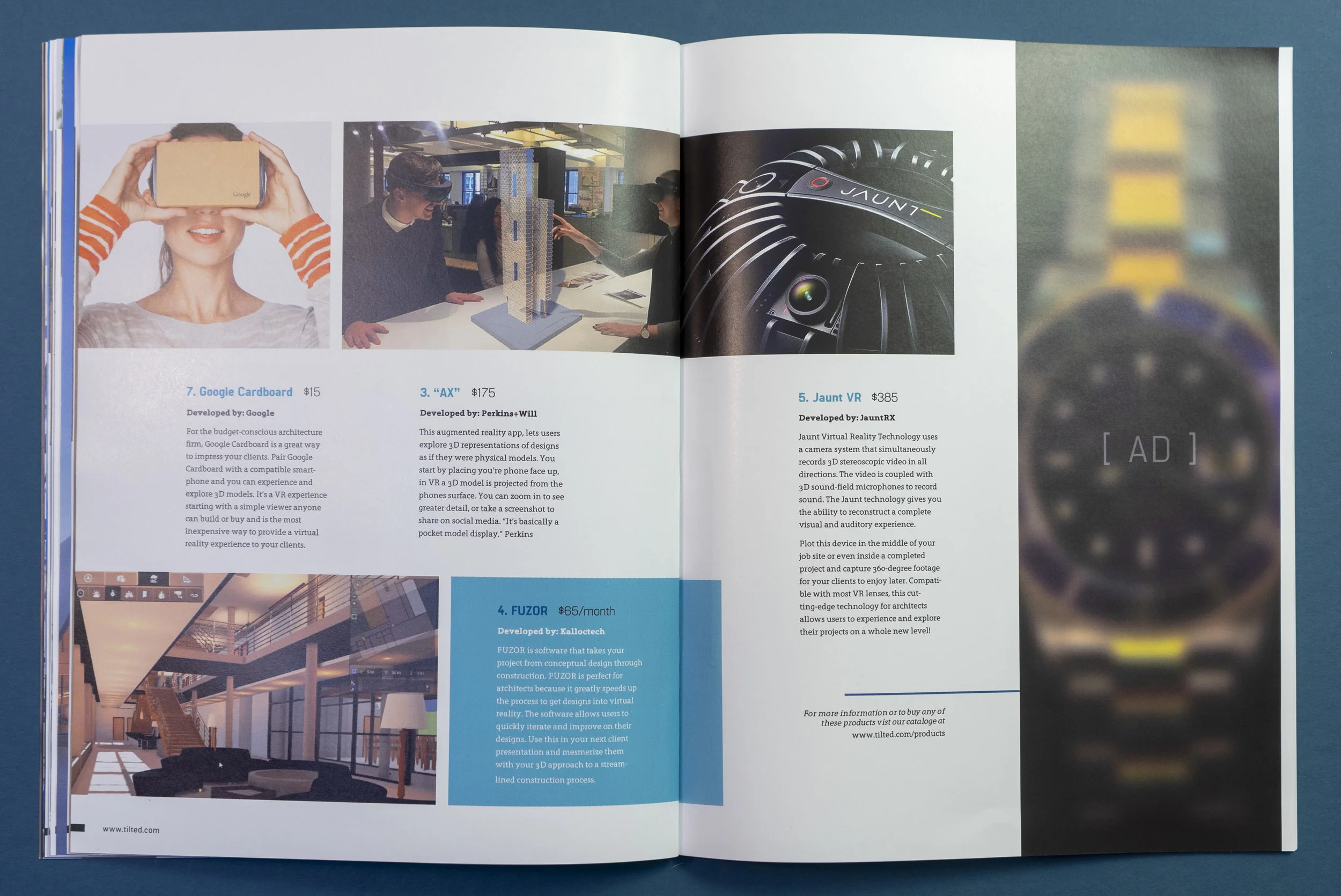
As the title suggests, this article serves as product review and promotion page, featuring new and upcoming technologies in architecture and design.


