Branding
PICTURED above is a series of Drink coasters I made for WICked Fresh.
THE Varied WOOD HIGHLIGHTS THEIR USE OF QUALITY FRESH PRODUCTS
And the DIVERSITY of flavor, diets, and customers they seek to serve.
MERCHANDISE
WICKED FRESH 2021 - 2022


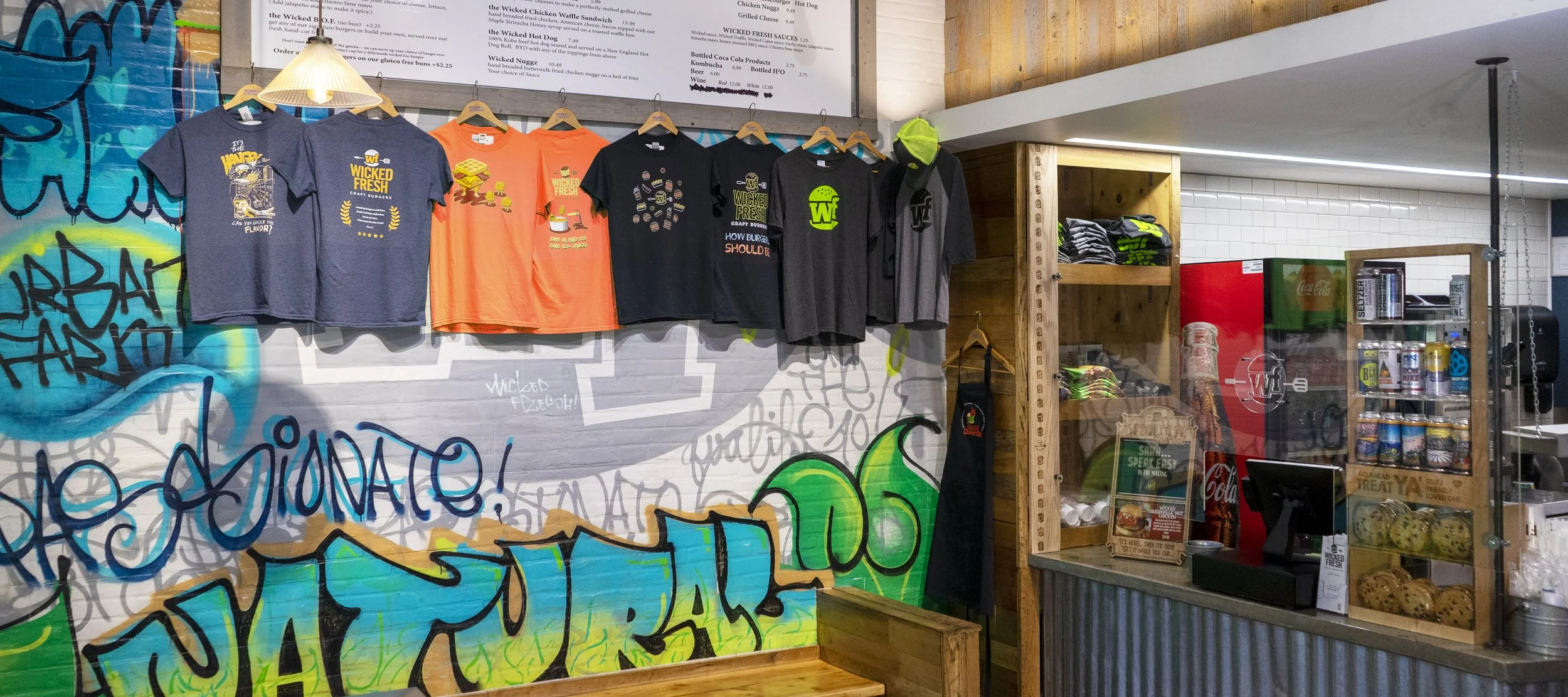
These shirts were my first project with Wicked Fresh Craft Burgers, they were commissioned to grow their brand by creating more merchandisable clothing than their current duel use employee shirts.
My proposed goal for the project was to create a unique design for each of their signature menu items, this was later cut to five. These sandwiches all had clever names so I tried to lean into fun imagery, visual puns, and some light satire. I also tried to capture some iconic styles.
15 MINUTE LOGOS
MinuteMan Press (2021-2023) & Freelance
During my time at Minuteman Press and in freelance, I created numerous logos. Working at Minuteman often required me to produce designs quickly, which posed a limitation on the creative process. Additionally, I encountered limitations imposed by clients, such as their preference for Dunkin's color scheme, the Godfather font, or a law firm requesting Comic Sans. Despite these challenges, I always was able to satisfy the customers’ wishes.
LOGO SETS
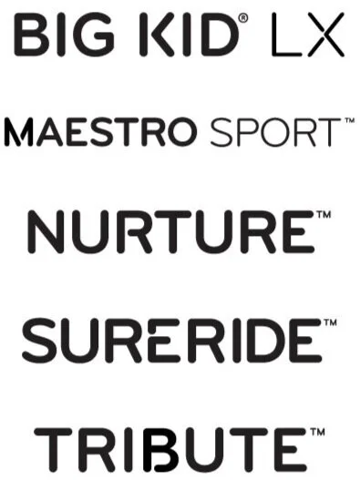
EVENFLO 2019 - 2020 | SILVER PRODUCT LINE LOGO SET
During my time at Evenflo I developed an alphabet and system to make logos for the “Silver” product line. Working from a few previous logos I created a look based on breaks within key letters, without feeling like a stencil. I created nearly a dozen logos based on this alphabet and set of rules.
LOGOS & BRANDING
Puffin Co. 2023 | Redesigning & Establishing a Brand
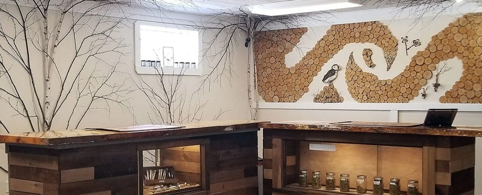
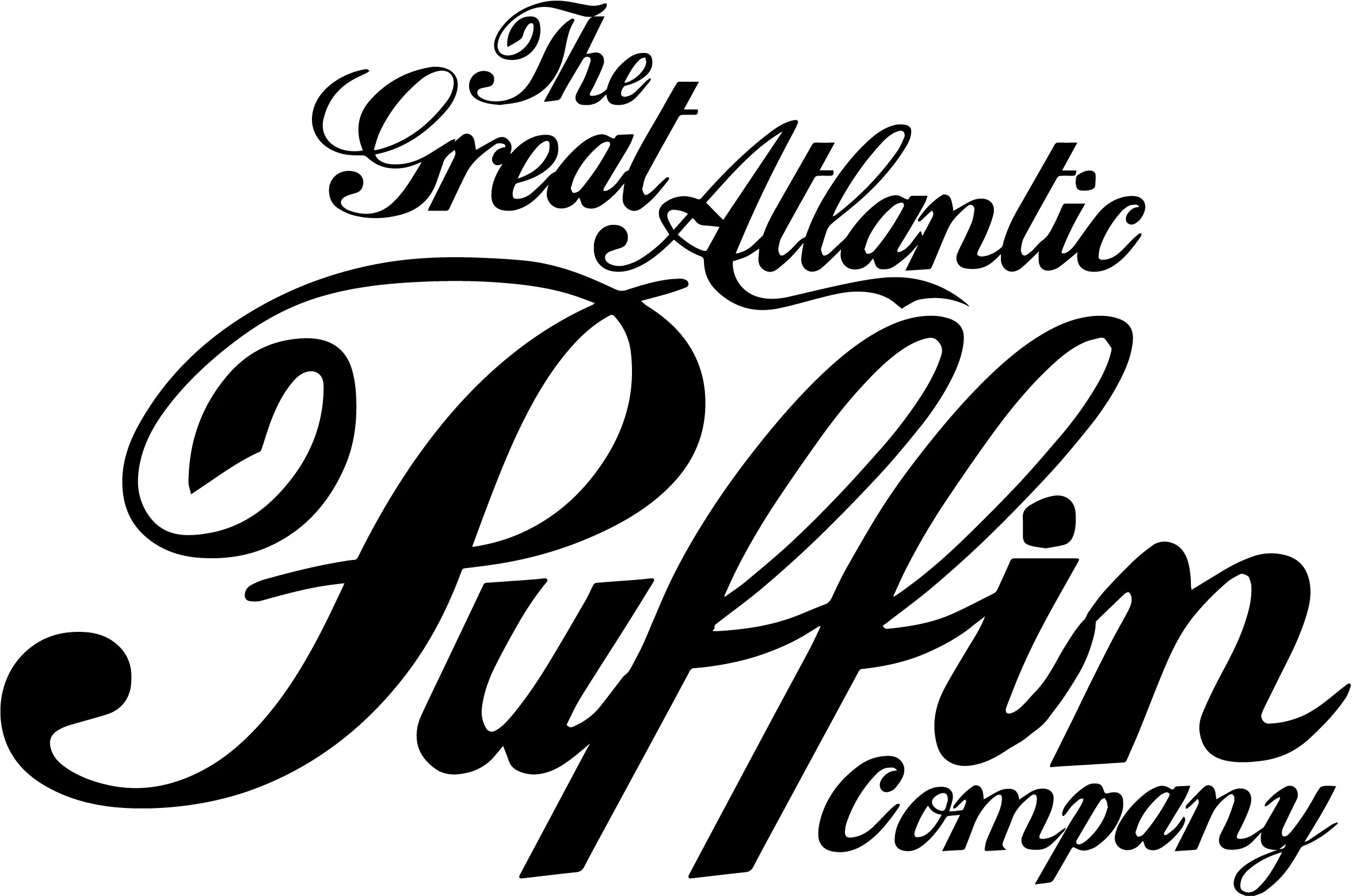
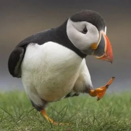
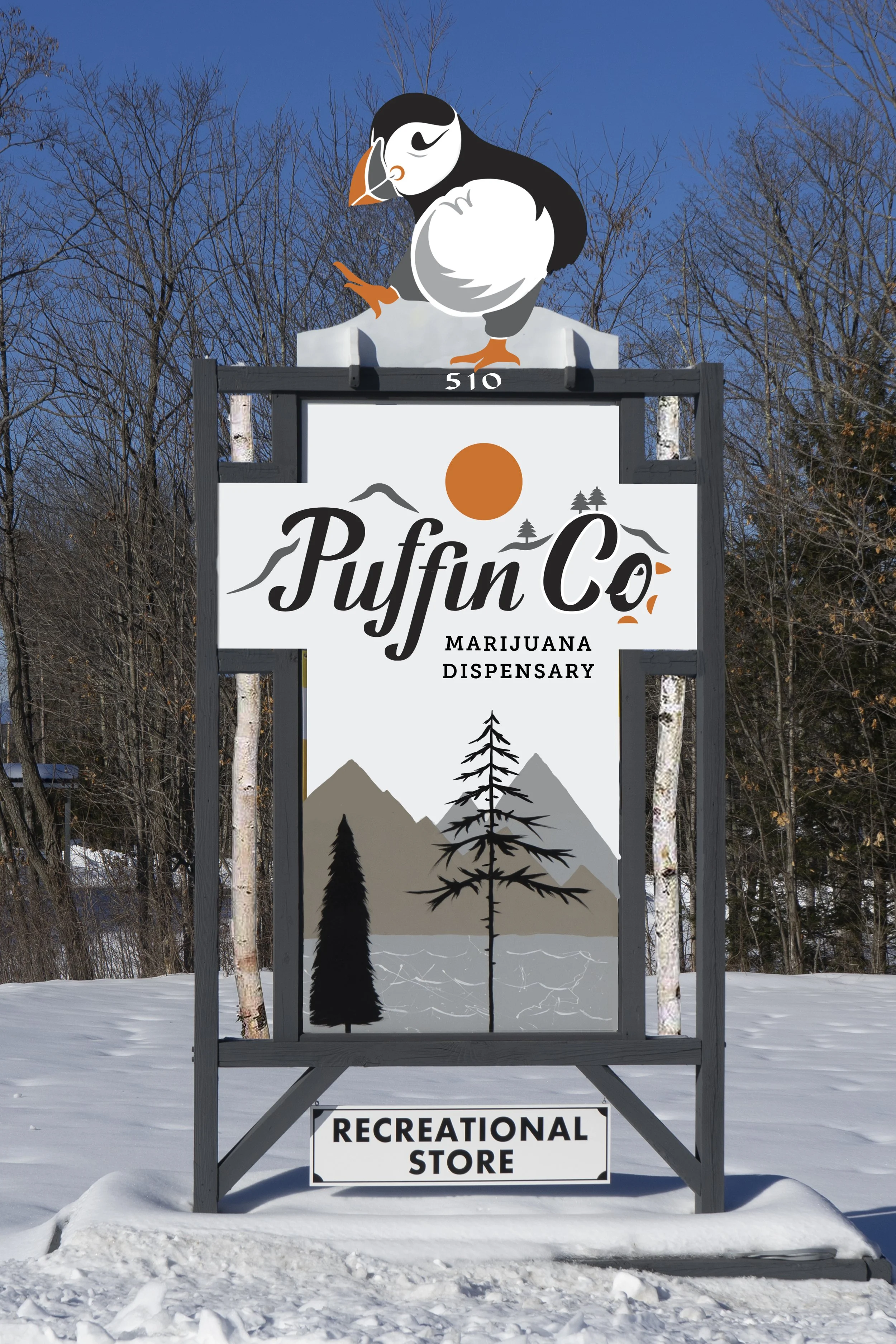
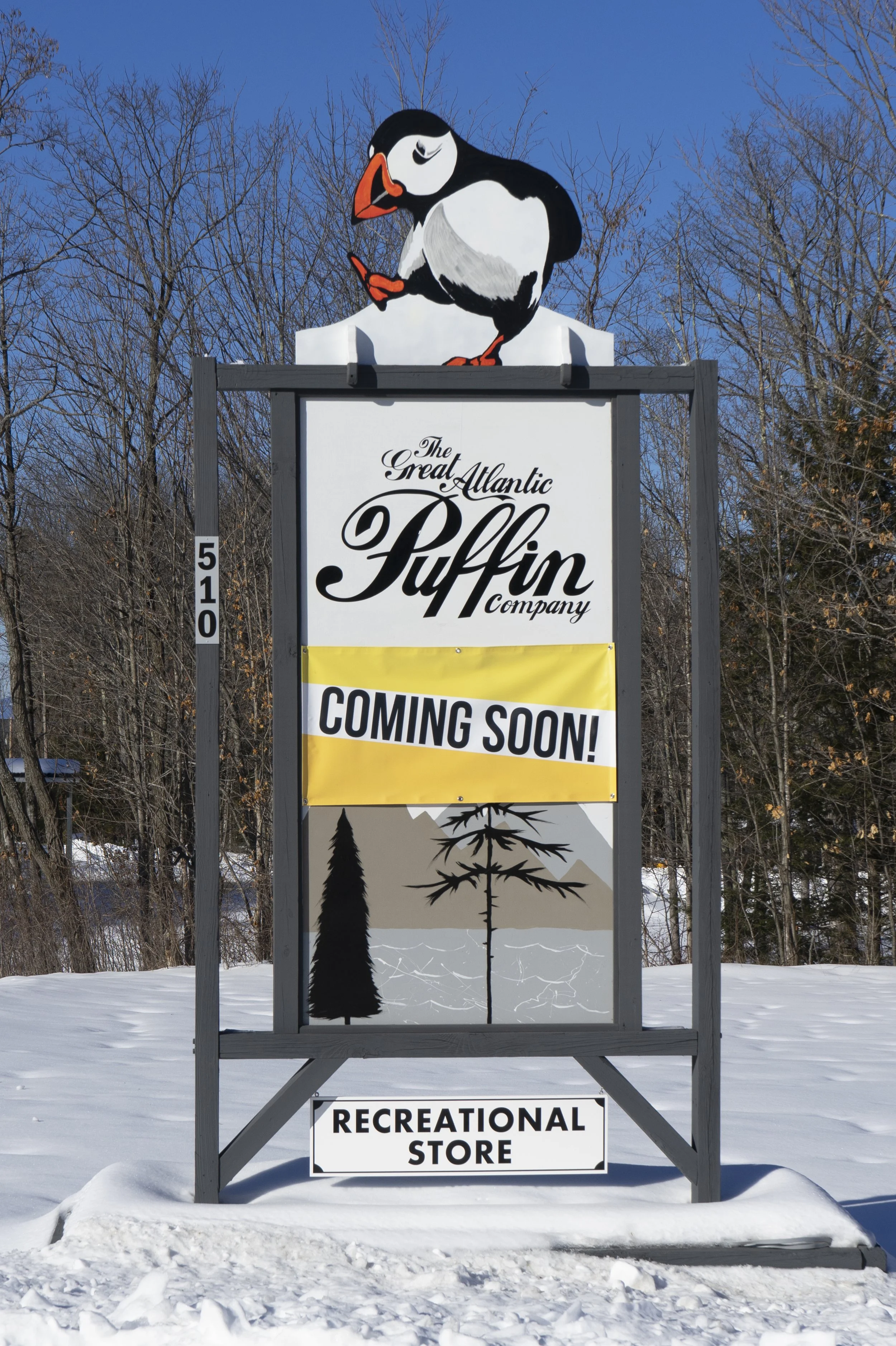
The Great Atlantic Puffin Company is a medical marijuana store. When I started working with them, they already had two stores in Maine, but their branding was not consistent. I had to incorporate various different elements into their branding, including basing the main logo on a modified picture of a dancing puffin. The current wordmark was hard to read as a logo because it had varied font sizes. There were also several other logos in use that needed to be addressed.
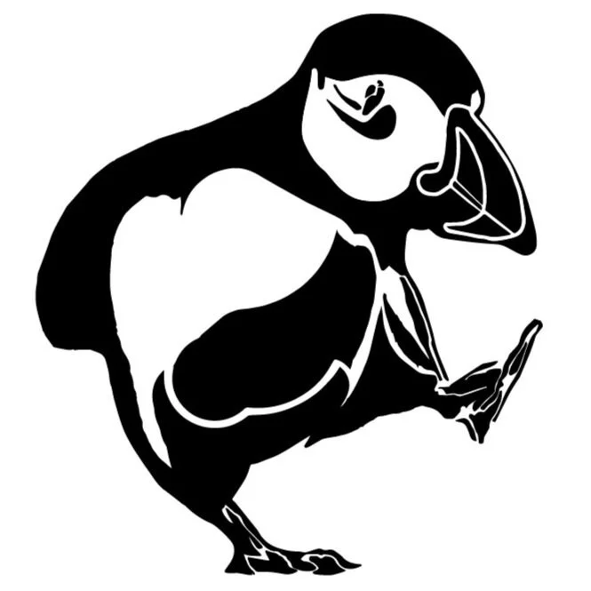
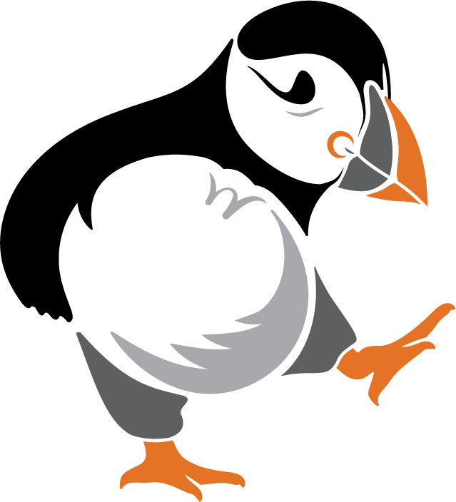
For my version of the dancing puffin I used the original photo as a reference, breaking it up into blocks of shade and color. The head and beak I kept the outlines accurate to the photo which helps capture the happy expression puffins are loved for. For the rest of the body I simplified certain curves to be more appealing as a logo, capturing only what was needed to remain true to the existing imagery.
The Dancing Puffin had to be paired with a wordmark. However, a law prevents the use of any image of an animal on THC containing packages. Therefore, the wordmark became a secondary logo that would mostly appear separately from the Dancing Puffin but would be visually tied to it. For the wordmark I incorporated imagery from a mural they had painted on their storefront, as well as making the “o” in Puffin Co. a nod to the Dancing Puffin. This little puffin however, would be removed when used on packaging and when the wordmark was smaller than 2” wide.
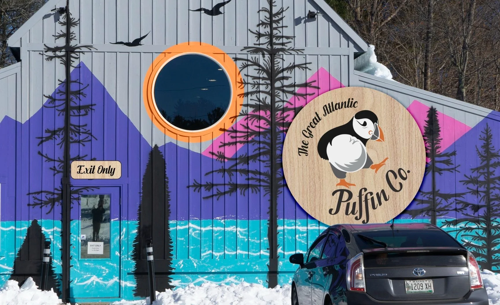
An emblem was also created with the Dancing Puffin to feature the company’s full name. The emblem would only be used when larger than 3” and would serve as a unified mark for the company; mainly for merchandise and indoor signage as the words become less impactful and legible at a distance or when printed small.
The image above is of one of their storefronts. Despite being outside the emblem was used here because it would mostly be viewed from a medium to short distance. The wordmark and Dancing Puffin would be used on the roadside sign for maximum legibility.
The wall mural was part of the visual inspiration for the wordmark. The orange ring “sun” around the window is my suggestion to tie the designs together. The birch logs added to the vertical gaps in the roadside sign also would tie into their interior design.


