Packaging
Two short studies on branding through packaging.
These conceptual designs are a practice in branding where packaging, perhaps, is the only way the consumer experiences the brand. This principle in particular applies to liquor and wine packing, and for good reason; most people make in the moment purchasing decisions based on appearance alone. Design, packaging, photography, etc. is self produced.
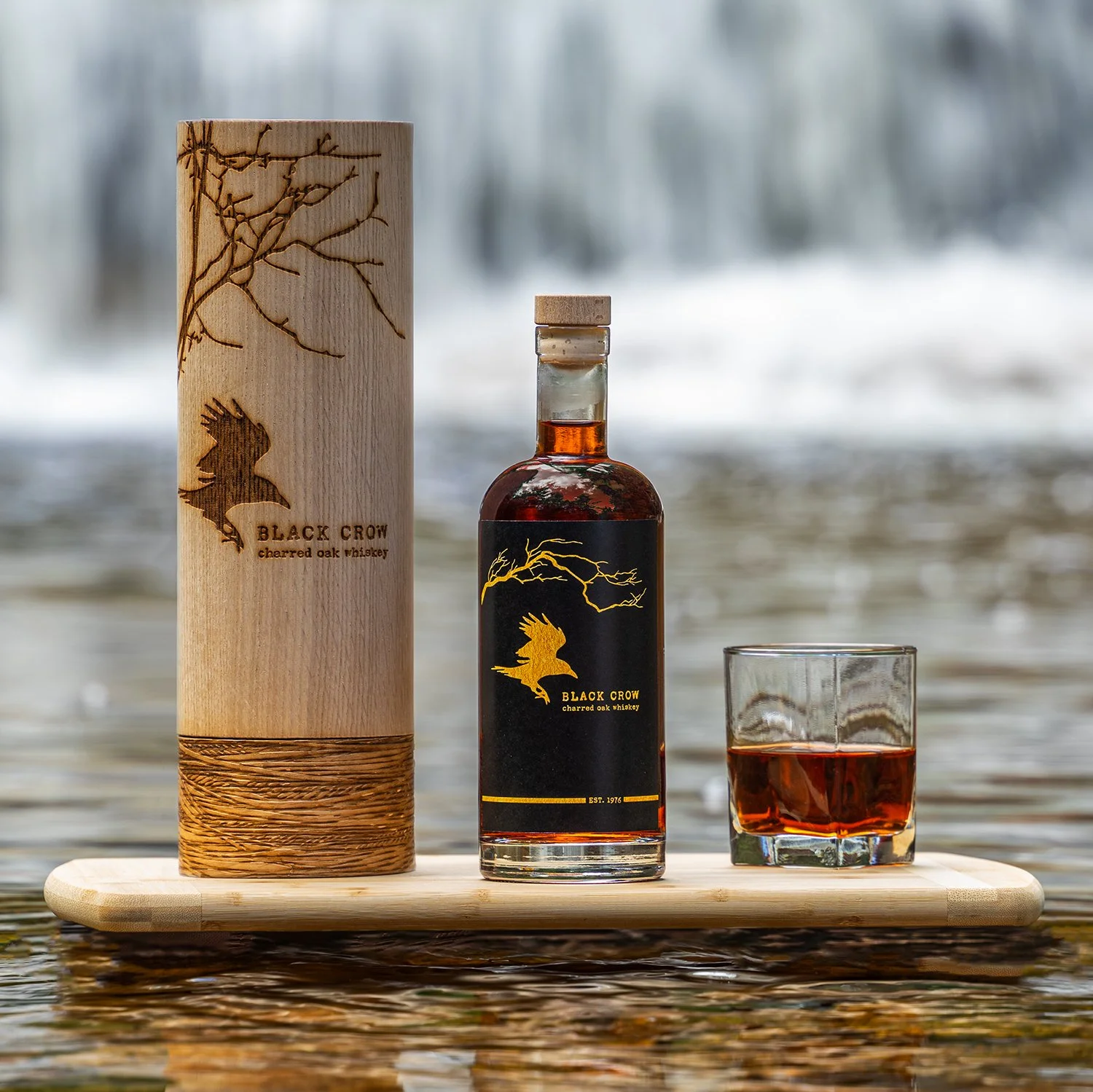
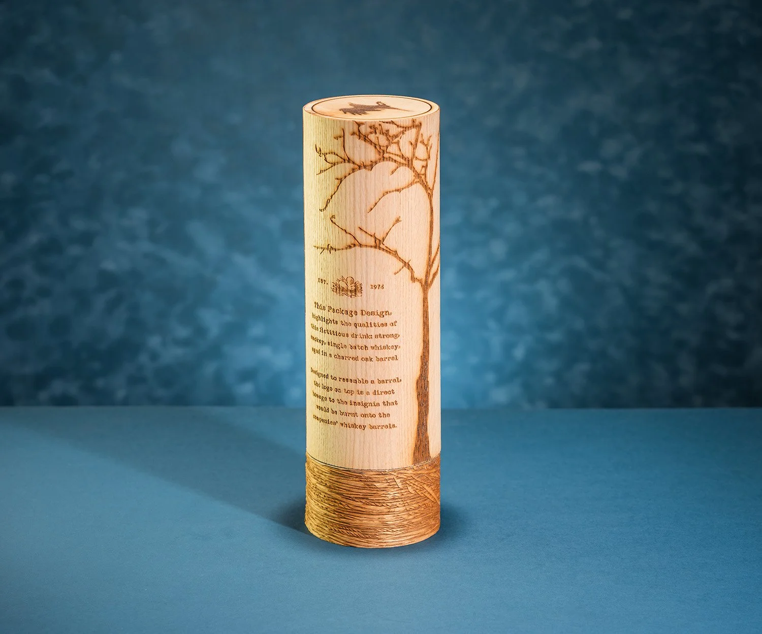
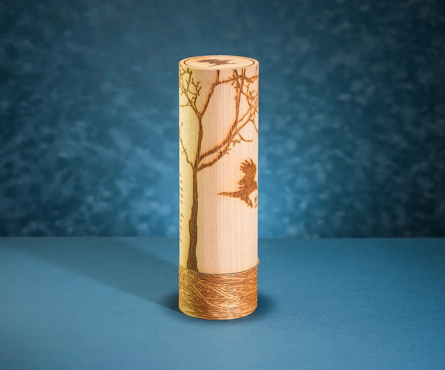
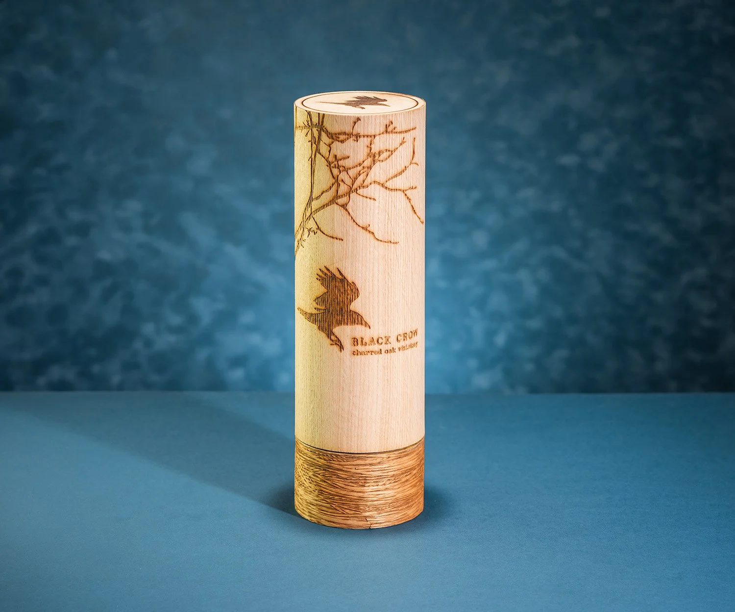
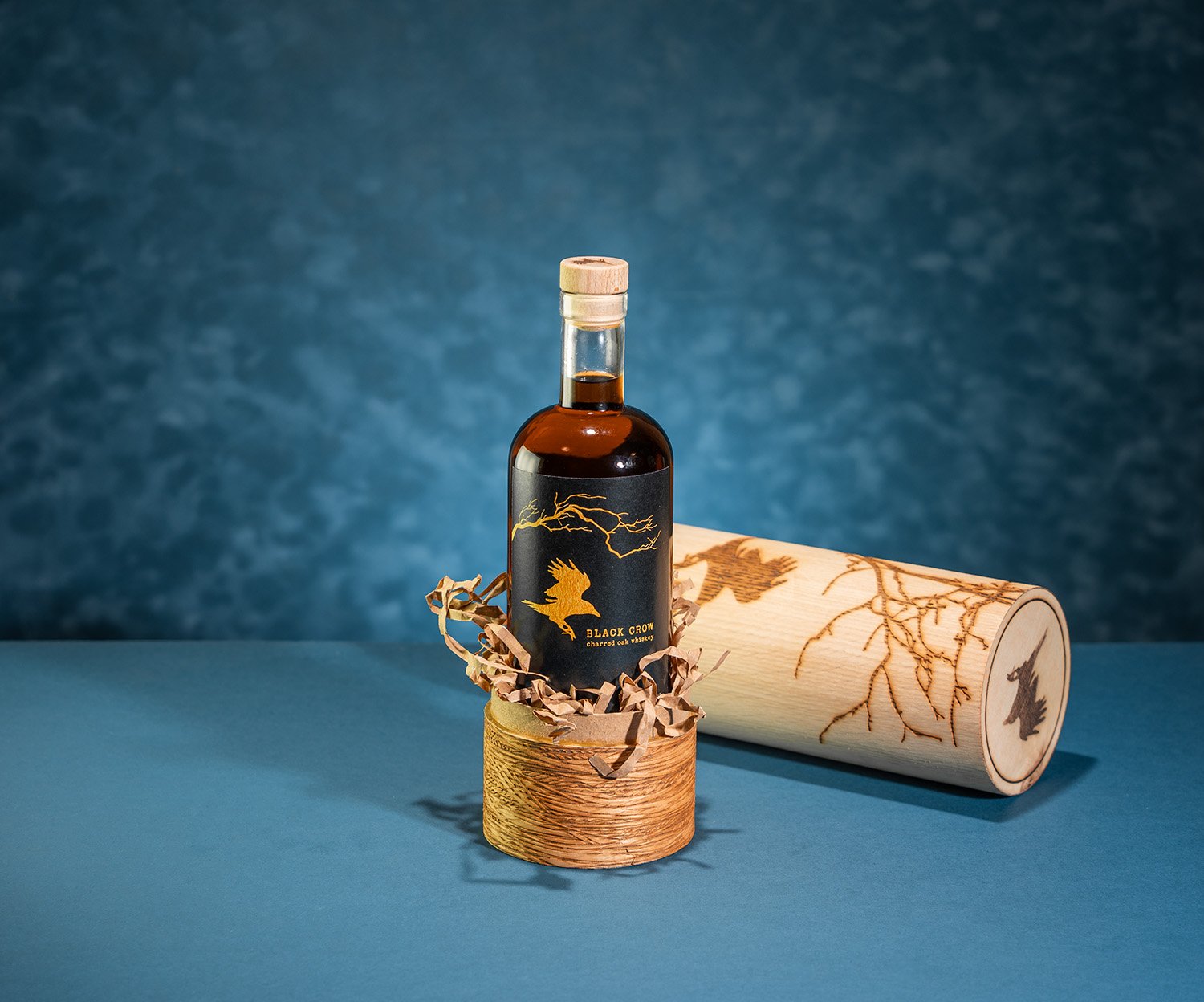
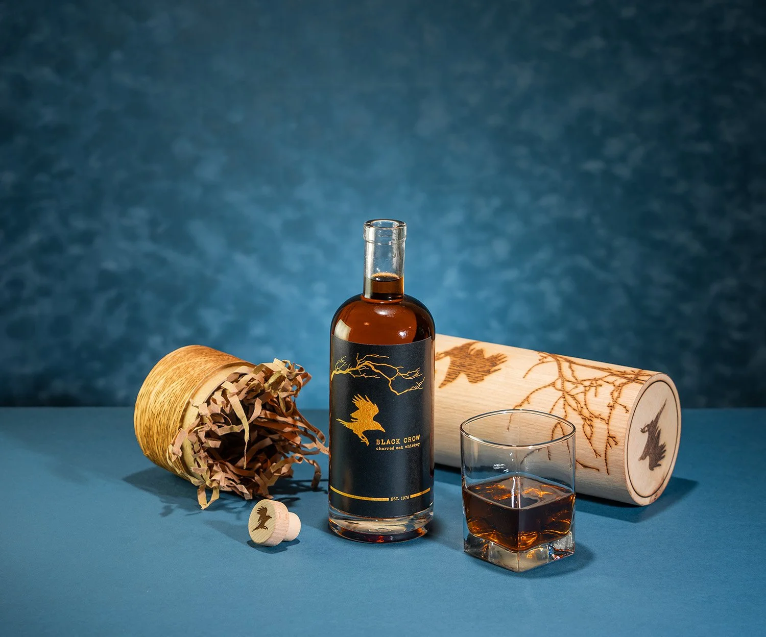
The packaging of Black Crow highlights the qualities of this fictitious drink: strong, smoky, single batch whiskey, aged in charred oak. Designed to resemble a barrel, the case is made from a simple cardboard tube laminated with an inexpensive oak veneer. Once opened the bottle appears sitting in a nest of shredded paper, which also protects the bottle during shipping. This makes the packaging much more environmentally friendly than most.
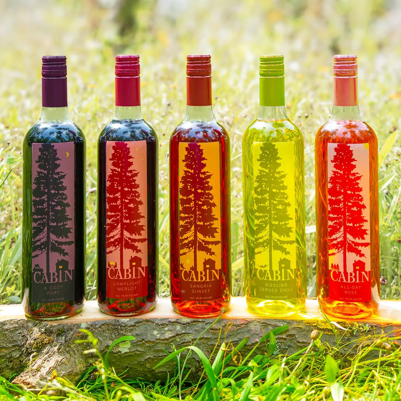
This striking slender label for CABIN Wine would make it a stand out on the shelves. The shape lends itself to the reoccurring image of a mighty pine and cozy cabin. Blurring the line between label and logo, this creates a strong, memorable brand. The juxtaposition of the towering pine and the quaint camp nestled bellow creates both a sense of coziness and grandeur.
CABIN Wine is the perfect pairing for campfires and good stories.
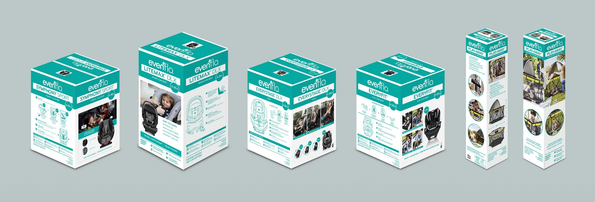
Evenflo’s silver line for Target’s on shelf collection.
DIRECT TO CONSUMER
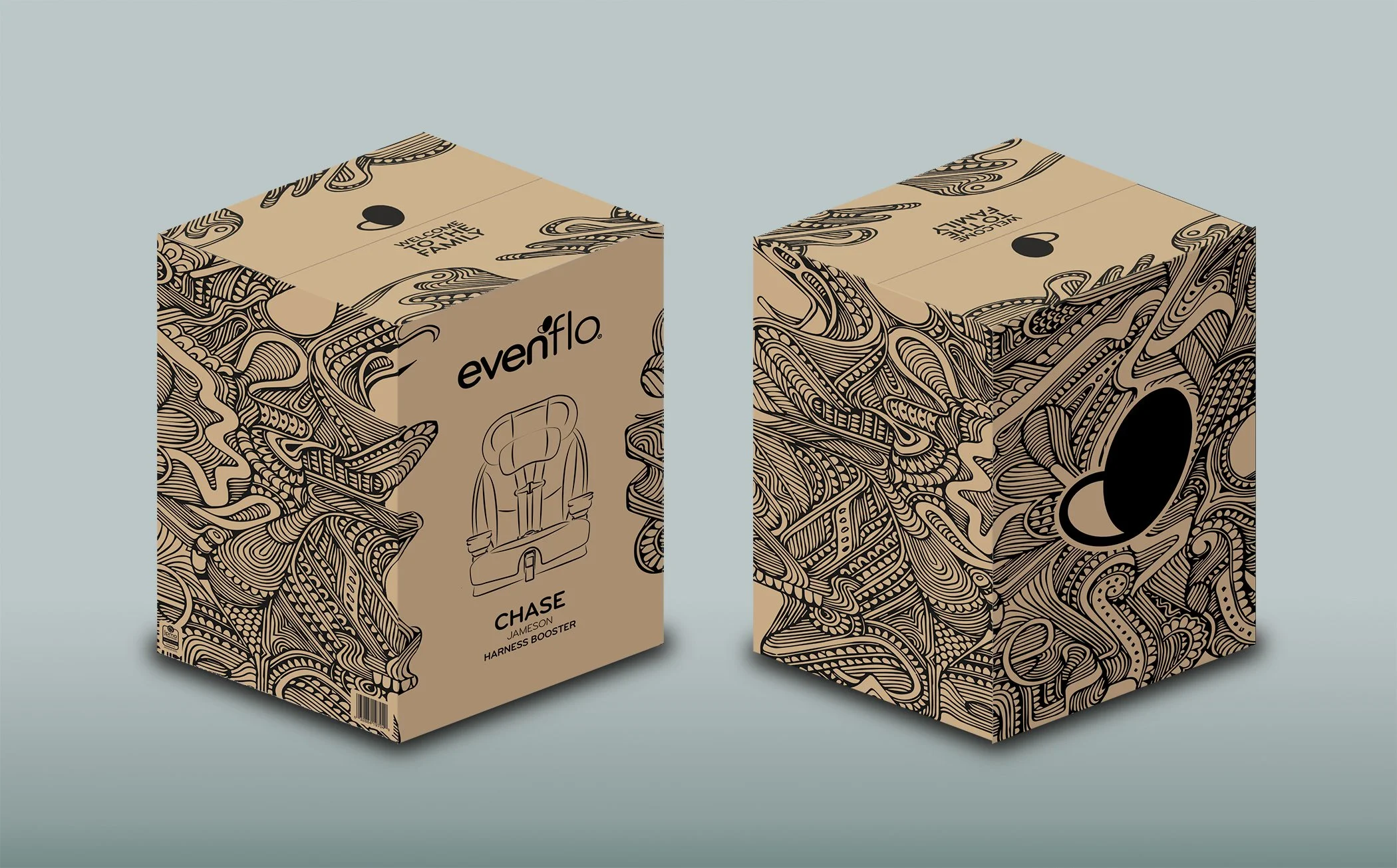
EVENFLO 2020 | DIRECT TO CONSUMER PACKAGE PROPOSAL
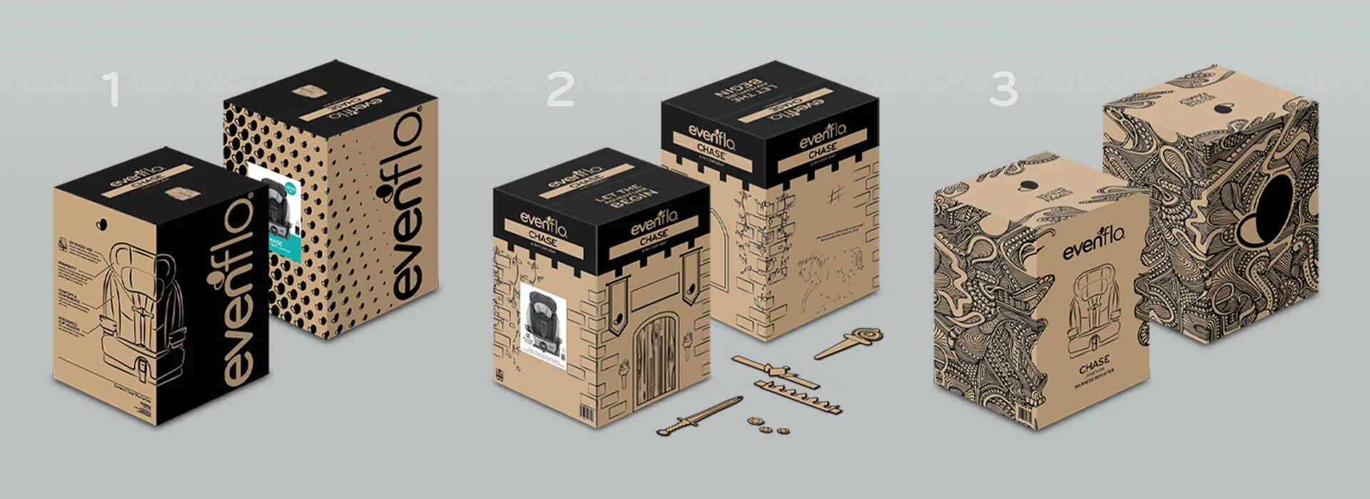
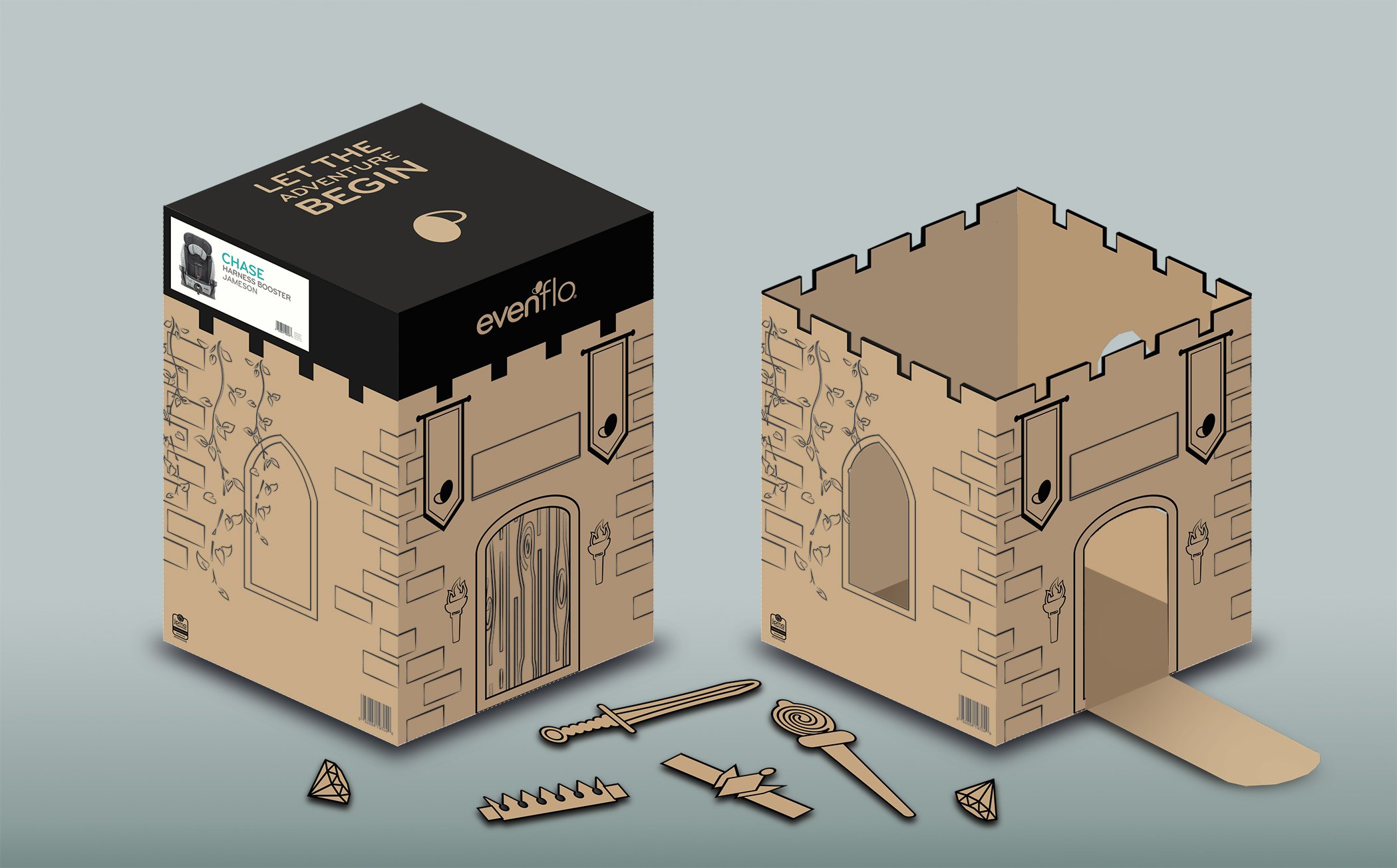
The goal of this solo project was to reimagine Evenflo’s direct to consumer packaging. The existing packaging was simply a black on craft version of the color on shelf unit. Instead of trying to sell the product we could take the chance to enhance the unboxing experience… a welcome to the Evenflo family.
ORIGINAL PACKAGE DESIGN
DESIGN DIRECTIONS
ON SHELF PRODUCT LINE
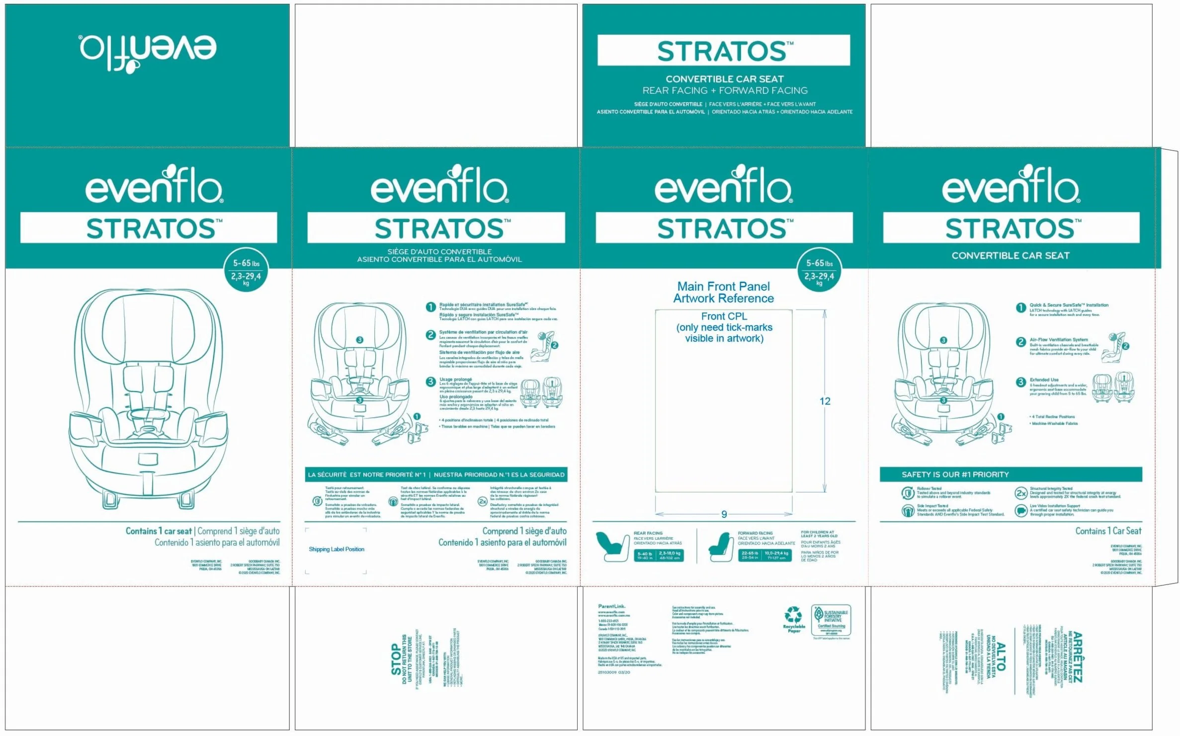
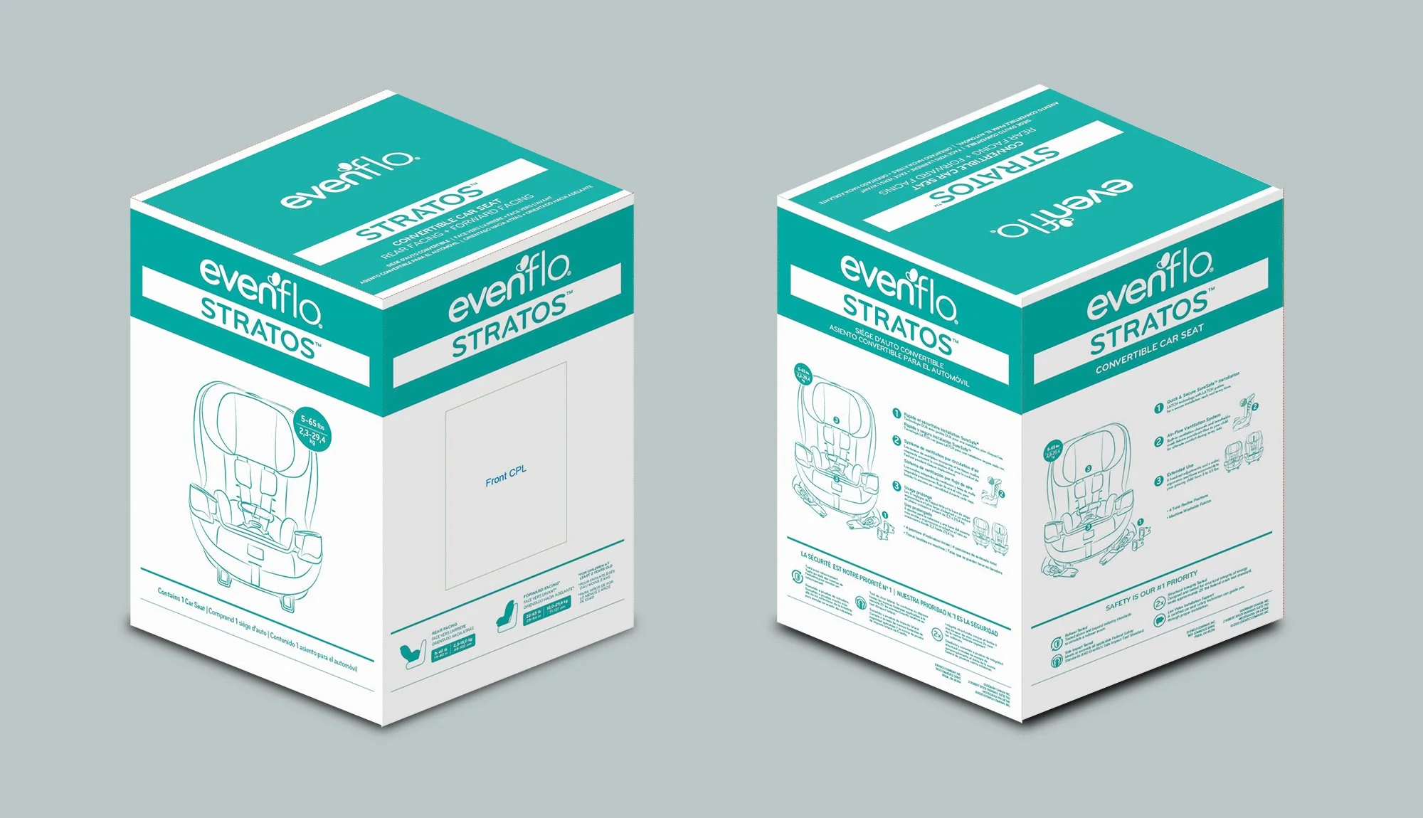
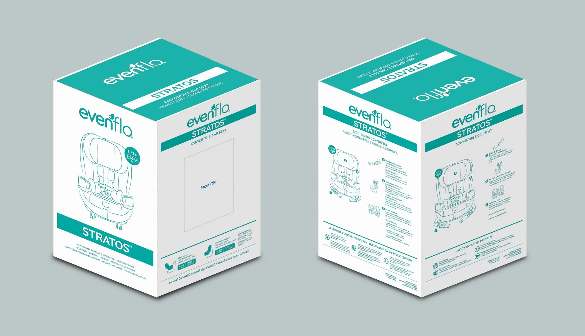
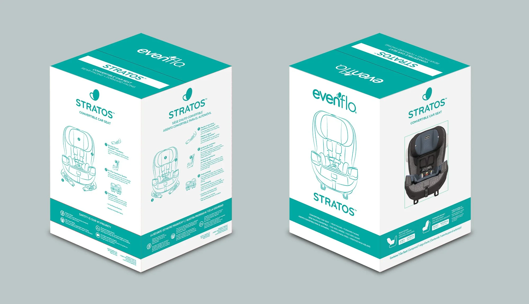
EVENFLO 2020 | EVENFLO 2021 PACKAGE PROPOSAL
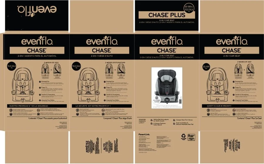
CURRENT PACKAGING DESIGN
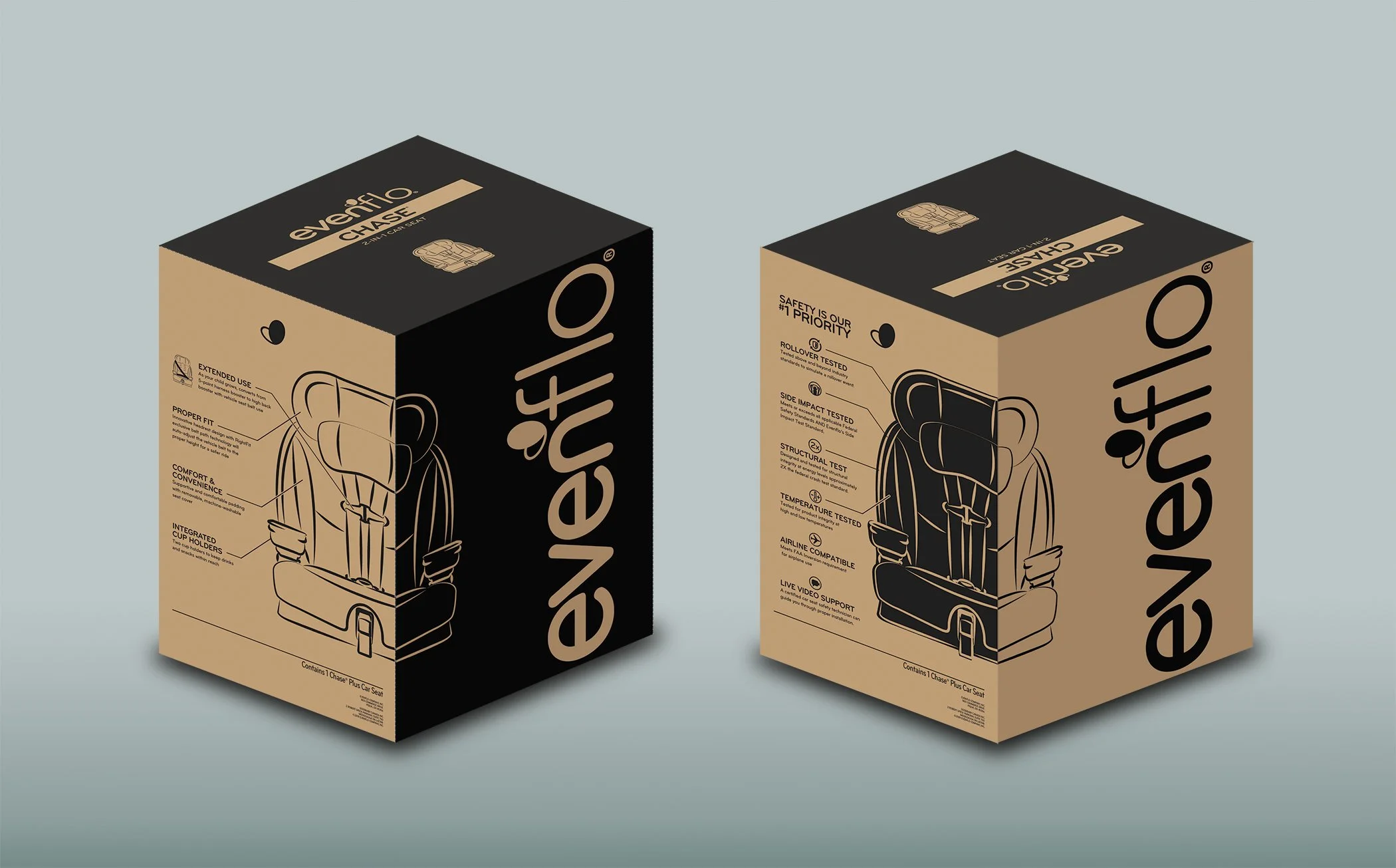
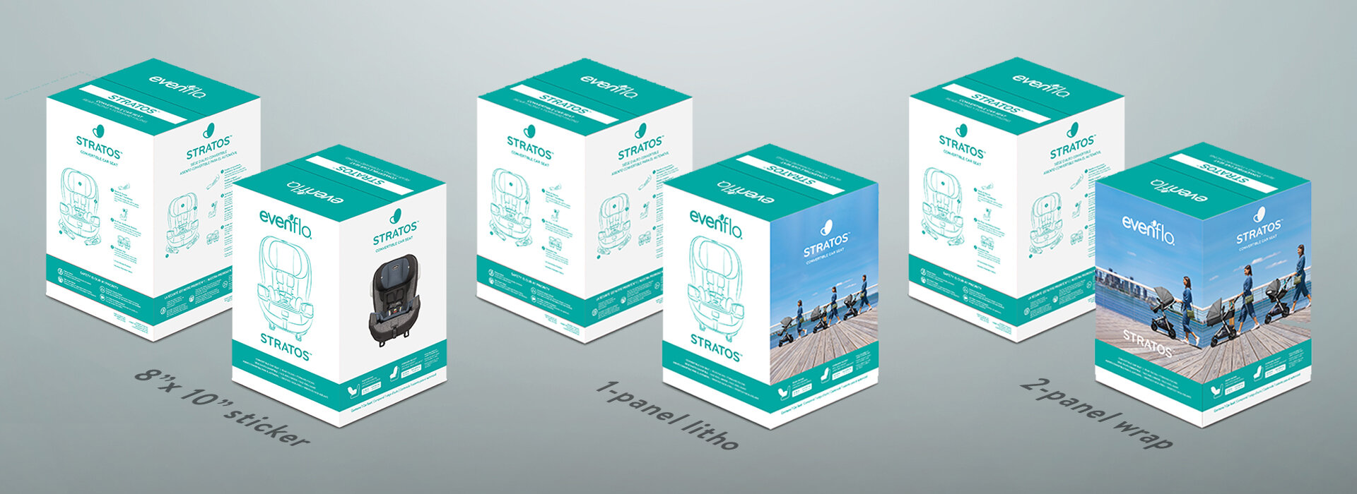
The goal of this solo project was to refresh the current design while maintaining the same information and general layout. Mainly the focus was on eliminating hierarchical redundancies, creating more white space and reducing ink.
OPTION 3 | Elegantly works with the standard 8” x 10” full color product sticker as well as both a one or two panel wrap (as seen below). Currently full panel wraps “broke” the normal packaging template and were treated inconsistently each time.
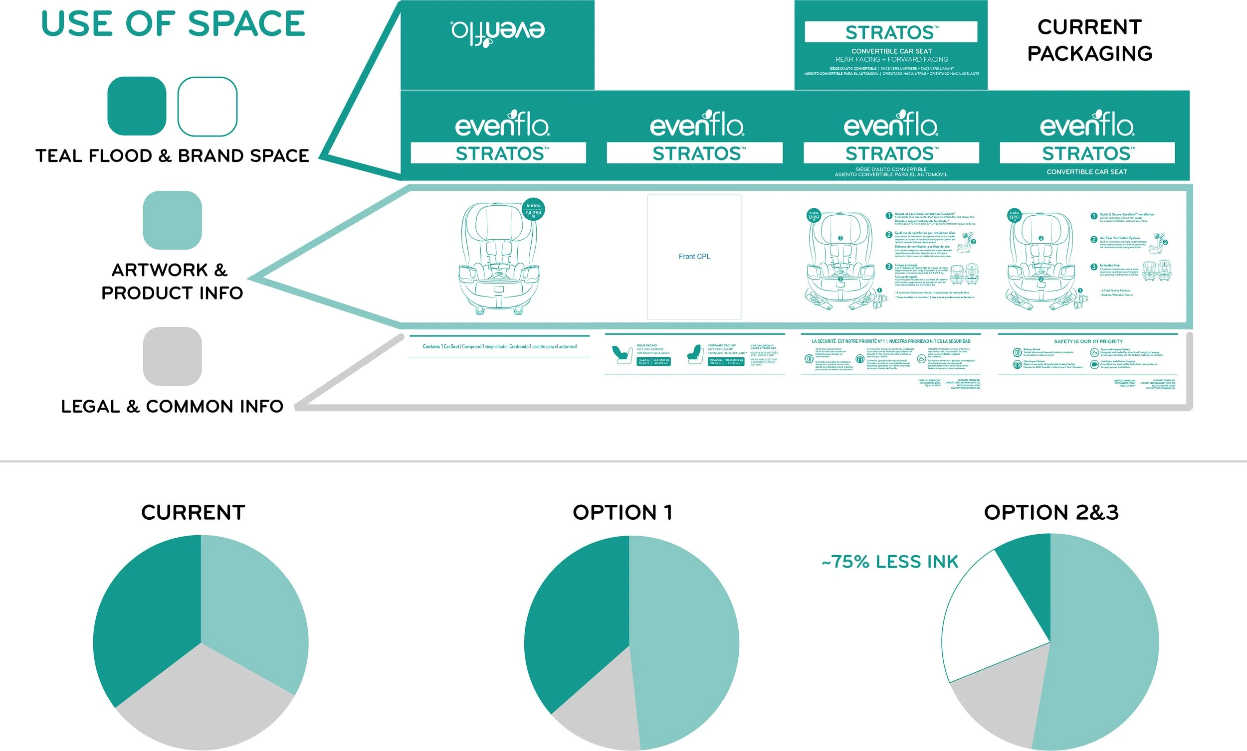
This graphic illustrates how the various design options utilize space, and can also give an estimation for how much ink will be reduced.
POINT OF PURCHASE
EVENFLO 2020 | PRINT PRODUCTION
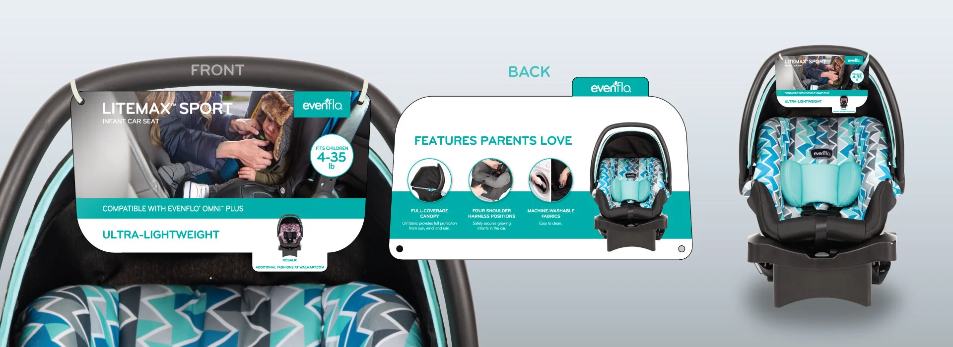
Above
This is one of many POP’s I did for Evenflo’s car seats. This includes all the photo-retouching. This was a fairly standard layout for most car seat POP’s; a lifestyle image on the front with the key features displayed on the back. I would also adjust the overall shape and hole placement to suit the handle and avoid folding or tearing.
Below
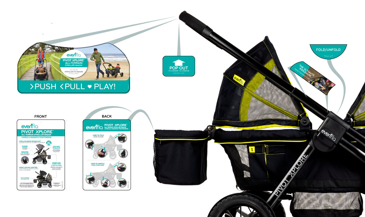
This is a rough layout of the POP components for the Pivot Xplore. The placement of stickers helps guide consumers and hangtags highlight key features. Larger projects like this were designed by multiple people. I severed as the final design-checkpoint, making corrections, adjusting dielines, and updating sku’s; seeing the project through to print.
DIELINE DEVELOPMENT
EVENFLO 2019 - 2020
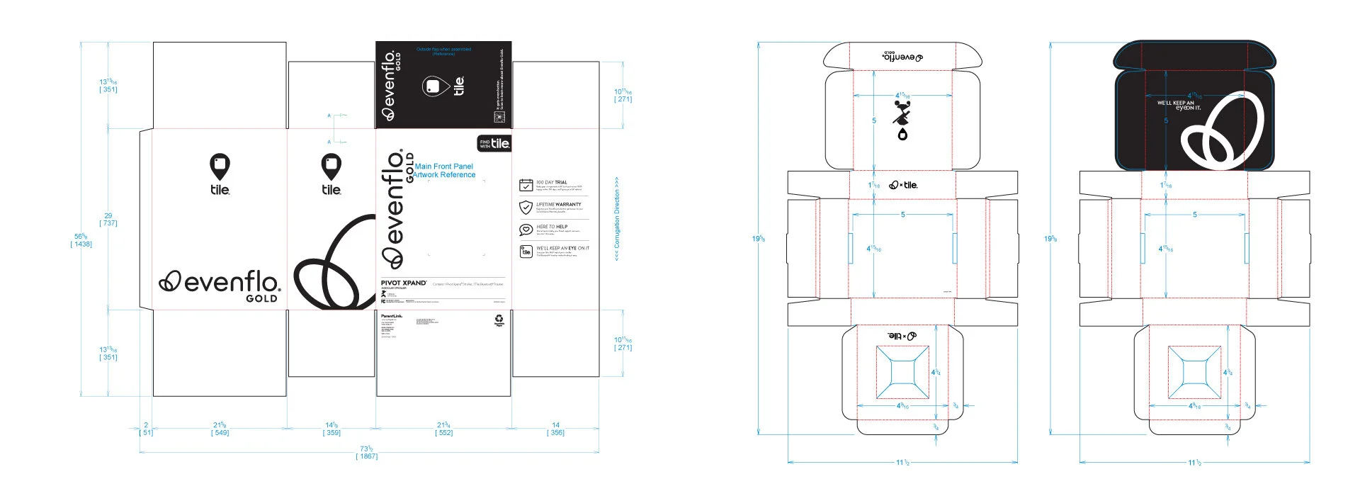
The featured examples are from a collaboration with Evenflo and Tile.
The development and refinement of dielines for both packaging and POPs is an important but often overlooked step. A well designed dieline can prevent tearing and folding. Color processing, image preparation, and adjusting to print material makes sure the design looks just as good off-screen as it does on.


